
1967 saw the birth of the Timor Calendar, the perpetual calendar designed by Enzo Mari for Danese Milano, as a synonym for modernity and timelessness. As a visual of time that does not pass.
In the search for a modern line, in the simplicity of its components, in the flexible use of plastic and in the search forinteraction with the user, it represented a ‘time measurer’ that never lost its topicality.
“I start working by negation and gradually go by elimination. The model that has remained standing after six months is the produced model. My project consists in decanting, in trying to eliminate what is useless and false‘. Enzo Mari
What is a perpetual calendar?
Every perpetual calendar includes a method, which, through an algorithm, makes it possible to derive the day of the week from any date on the calendar. This is because a ‘compound’ date is shown, taking into account all the months, with their different lengths, including February with its leap year.
The history of the Timor Calendar
Enzo Mari designed the Timor Calendar for Danese Milano inspired by old railway signs from the 1940s, a time when he was still a boy. The 1960s, however, were also the era of the economic boom and post-World War II consumerism, and Timor brought with it, as an artistic quest, the idea of contrasting precisely the ‘disposable’ canvas of those years.
Initially, Bruno Danese, founder of the eponymous brand, decided to name all the brand’s products after islands. Thus Timor, which means East, finds its etymology in the Malo-Polynesian languages (characteristic of South-East Asia, the Pacific Ocean and mainland Asia) and derives precisely from one of the islands of the Indonesian archipelago.
The design of the Timor Calendar
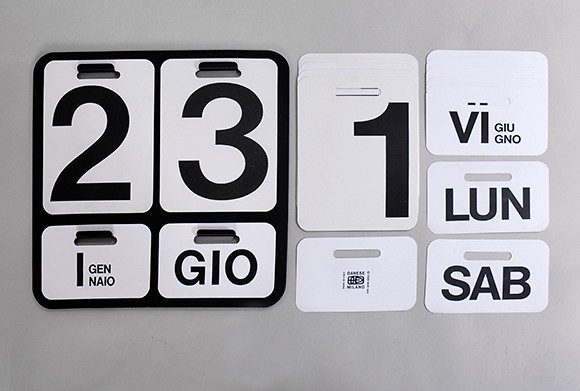
Timor is a perpetual desk calendar made of PVC. It is structured on a moulded ABS (acrylonitrile-butadiene-styrene) pivot, to which the month, number and day of the week palettes are attached by means of fan-opening bands. It was produced in black and white and made available in Italian, French, German and English. The font chosen was Helvetica, synonymous with readability and immediacy, both for Mari and the company. It measured 17 cm in total width, 16 cm in height and 9 cm in depth.
The plastic material
Mari’s decision to use a plastic material was based on the technical possibilities offered and the modernity of the product. Plastic, at that time, was considered a symbol of freedom, equality and democracy, which, in the calendar, were echoed in the characteristics of flexibility, washability, modularity and transformability.
The intention to ‘dedicate time’ to time
The Timor calendar was also created with a view to engaging the user with a symbolic message. In fact, on a daily basis, the consumer had to interact with it in order to update the month and day. time is never spent unnecessarily, as it is in his or her interest to be aware of the current date.
Mari’s artistic line: between fascination and animal inspiration
Mari’s artistic line, which we find in the design of his works, constantly draws on his admiration and fascination for the stylised forms of animals. And so it is that even in the Timor Calendar, in addition to the inspiration given by railway signs, we find, in the position with closed slats, almost the evocation of the pelican‘s head and beak. With open lamellae, on the other hand, it brings to mind the wheel of the peacock, when it opens its tail, and finally, when the lamellae are half-open, they recall the shape of the cock‘s crest.
Enzo Mari’s other calendars for Danese Milano
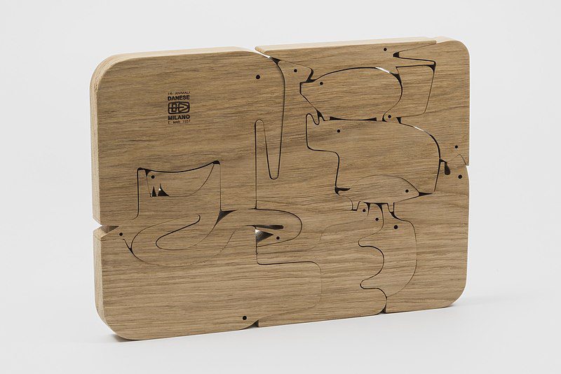
The Timor Calendar was only the last of the calendars designed by Mari for the Milanese company. The first, in chronological order, had been Bilancia, the wall calendar designed in 1959, made of wood and silk-screen printed. Its structure was based on a game of balances, overturning the concept of scales and applying it instead to the concept of measuring time.
Then, in 1963, Enzo Marzi designed Formosa, again a wall calendar made of aluminium and PVC sheets, also using the Helvetica font for this. This is how the measurement of time gradually became a design icon. Thus design never remains mere planning, but research and investigation, embodying the suggestions of a thought that is, after all, timeless.
Camilla Pieri
@Stiledesign. Reproduction reserved
You might also be interested in:


