
The Olivetti Lettera 22 typewriter is a timeless icon that has left an indelible mark on the history of the industry.
Designed by Italian engineer Marcello Nizzoli and introduced to the market in 1950, the Lettera 22 revolutionised the way people wrote and communicated. It brought with it elegant design, advanced functionality and superior performance quality.
Olivetti Lettera 22 – a modern look
The machine immediately stood out for its modern and charming appearance. Available in a range of vibrant colours, this typewriter embodied a sophisticated and distinctive aesthetic. Its compact, streamlined design was in stark contrast to the bulky, heavy typewriters of the time and offered a sleek, professional visual.
Features
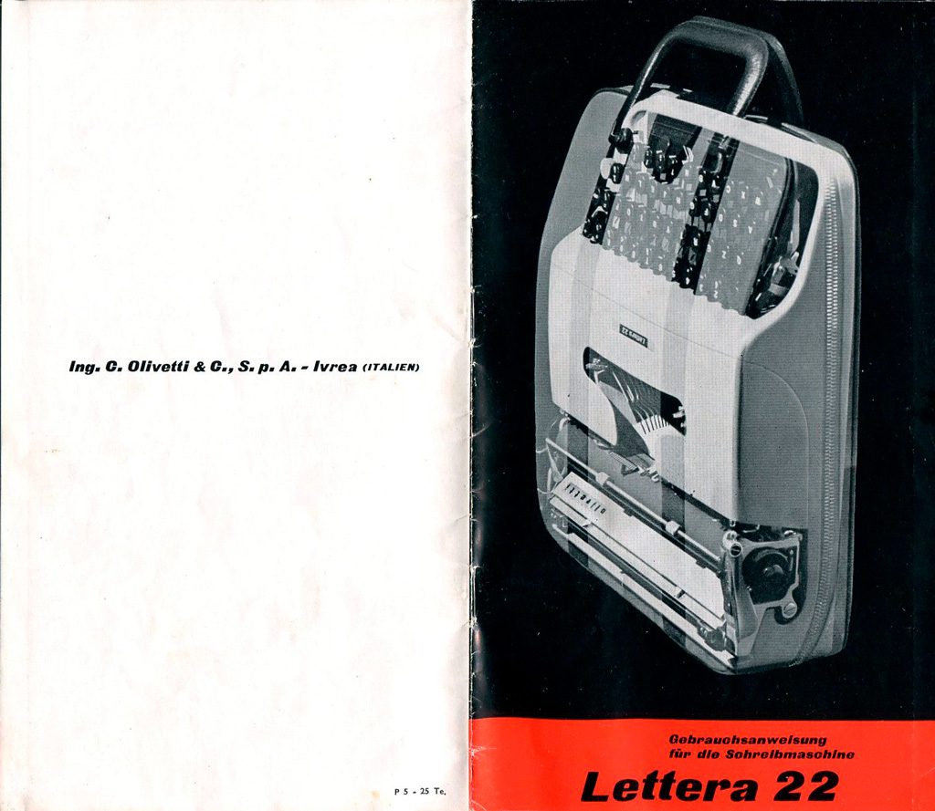
The first impression of the machine was one of lightness and agility and its measurements were 8.3 x 29.8 x 32.4 cm. In reality, having to guarantee robustness and quality performance, the weight was not indifferent and was still around 3.7 kg.
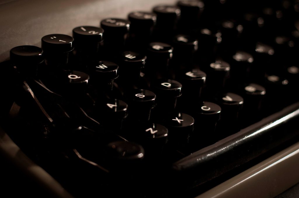
The keyboard and roller were incorporated into the bodywork, from which only the knob protruded. Thefootprint of the spacing lever was also minimal to best meet portability requirements. A case with a handle facilitated transportation.
Performance was excellent thanks to the precision of the printing hammers and kinematics designed to make pressing the keys light and agile.
Important functions
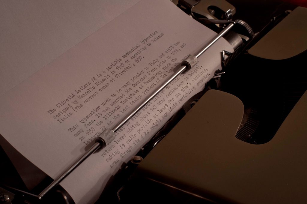
The most important function that characterised the instrument was its automatic carriage return system. Once the end of the line was reached, it would automatically return to the beginning of the next line, allowing an uninterrupted flow of writing.
Also important were: the possibility of writing in red or black or even without ink to prepare matrices and copying functions, using carbon paper; it was thus possible to obtain multiple copies of a document.
Ergonomic keypad
The ergonomic key pad was designed to enable fast and accurate typing, minimising errors and finger fatigue. The intuitive key layout made typing a smooth and enjoyable activity, resulting in increased productivity and flawless text creation. The return key and tabulation key were also present.
One of the few limitations it had, due to the need to keep its size down, was for example the absence of the number 1 key, which was achieved by using the lower-case letter elle.
Dissemination
Sales of Lettera 22 were due to its relatively low price – 42,000 lire, which, in the 1950s, corresponded to an average worker’s monthly wage – as well as lively advertising campaigns.
Success was immediate and involved more and more categories of users, even outside the offices. Illustrious writers and journalists, including Montanelli and Biagi, made Lettera 22 an inseparable travelling companion, which they did not give up even with the arrival of electronic writing.
It remained on the market until the mid-1960s and, in those ten years, a total of around 2,000,000 units were produced.
Design icon: the Golden Compass and MoMA
The Lettera 22 was not only a functional typewriter, but also an iconic design object. The clean, sinuous lines combined with the eye-catching colours made the typewriter a work of art to be displayed on desks.
A symbol of elegance and style that conferred prestige on whoever owned it, it was awarded the Compasso d’Oro in 1954.
It entered the permanent collections of MoMA . This underlines its lasting impact in the field of industrial design and its status as an iconic object, as well as highlighting its historical importance. The presence of Letter 22 is tangible evidence of how functional design and technological advances can merge into an art form in its own right.
The font OT L22
An acronym for Olivetti Type Lettera 22 is the font inspired by the founding principles of Olivetti’s experience and style: Italianism, mobility, lightness and beauty.
Created to mark the 70th anniversary of the birth of the typewriter, it was intended to commemorate and pay homage to the object that is now part of the genetic heritage of Italian and world creativity. The font also exists in a digital version, usable by everyone and on every device.
Stamp
Having become an integral part of the global cultural heritage, this typewriter had such a significant impact on the society of the time that, in later years, the Italian state issued a commemorative postage stamp to celebrate it.
Despite the advent of digital technologies and the disappearance of traditional typewriters, the Olivetti Lettera 22 remains a symbol of a bygone era. It is a collector’s item, loved by vintage typewriter enthusiasts who appreciate its unique design and historical value.
It also remains a tangible reminder of a time when writing required different dexterity and attention; a time when the sound of a typewriter’s ticking evoked the art of creating words on paper.
Leonardo Vignoli
@Stiledesign. Reproduction reserved
Youmight also be interested in:


